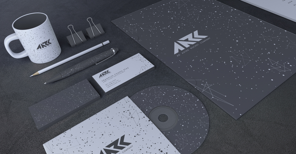
Re-brand of Ad Astra Rocket Company

In this project, I rebranded a company that is working with helonic plasma waves and electric rockets in hopes to one day achieve commercial space travel in a realistic time frame for civilians.
The logo design was inspired by the angular shape of the rocket's wings. The background was created with the idea of connecting the everyday person to the planets and stars in outer space, and allowing them to see cosmos as no one has before.
In the rebrand, I showcased the space station, rocketship, satellite, stationary, gift bags, and tickets as if these commercial flights were already running. These tickets are imagined as a medallion that can fit within multiple casings to function as a watch, necklace, etc. while on the flight. They can hold your card information to pay for items while on the commercial spacecraft, showcase one's vitals, and allow the passenger to see the takeoff countdown.


